

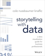
Sometimes it is easy to generate charts and graphs look fine to you, but don't clearly communicate the information that they represent. Knaflic's own knack for clarity will help you sharpen your message when using data in your business presentations. "Storytelling with Data tea…

Here, the news graphics director at The Wall Street Journal gives a step-by-step guide to executing clear and concise graphics for everyone from the average PowerPoint user to the sophisticated professional, showing how to use different techniques to convey messages eloquently a…

"Included are chapters on the basics, on emerging methods and genres, and on the social life of the digital humanities, along with "case studies," "provocations," and "advisories." These persuasively crafted interventions offer a descriptive toolkit for anyone involved in the de…

A visionary report on the revitalization of the liberal arts tradition in the electronically inflected, design-driven, multimedia language of the twenty-first century.

The author uses examples from art, design, business, statistics, cartography, and online media, to explore concepts and ideas about illustrating data.


This O'Reilly cookbook provides more than 150 recipes to help scientists, engineers, programmers, and data analysts generate high-quality graphs quickly without having to comb through all the details of R's graphing systems. Each recipe tackles a specific problem with a solution…


This second edition of the classic textbook, The Archaeologists Laboratory, is a substantially revised work that offers updated information on the archaeological work that follows fieldwork, such as the processing and analysis of artifacts and other evidence. An overarching them…